
Designing with empowerment & inclusivity in mind:
Vegout is a mobile app that helps people with dietary restrictions find restaurants catering to their needs.
ROLE
UX/UI Designer
Brand Development, User Research, Wireframing, Prototyping, Project Management
PROCESS
Discovery
Brainstorming
Design
Testing & Redesign
Reflection
TOOLS USED
Figma, Adobe Creative Suite, Miro
TIMELINE
16 weeks
The problem:
Dining out can be challenging for those with dietary restrictions, often leading to exclusion and frustration.
Research indicates addressing emotional, social, and informational factors is key, involving managing emotions, overcoming social barriers, finding clear menu info, and promoting inclusive options.
How does VegOut address it?
VegOut's design allows users to easily discover restaurants that cater to their personalized dietary requirements.
Users can also read reviews on food quality, atmosphere, and restaurant accommodations written by others in the community. VegOut fosters a sense of belonging and trust in restaurant choices, making it easier for users to confidently find the perfect dining experience.


Discovery
Secondary research:
During my secondary research, I found that individuals with dietary restrictions and allergies face numerous challenges while dining out. I have identified three crucial points for this particular group:
Emotional & social impact
Over half of individuals adhering to dietary restrictions face challenges when dining out.
61% of vegans report feeling judged when during dining experiences, while 52% of those following other diets struggle due to limited menu options.
Transparency is vital
86% of consumers value menu transparency, focusing on artificial ingredients (72%), fresh ingredients, calorie counts, and allergens.
Accurate information is critical for healthier dining choices, driving the demand for more transparent menus.
Inclusive menus
Despite the growing popularity of vegan, vegetarian, gluten-free, and keto diets, many people still struggle to find suitable restaurant options.
77% of diners check restaurant websites before dining out, and 70% have skipped visiting a restaurant due to the website, showing that available menu options are crucial in deciding where to eat.
Primary research:
I created a research plan to assess challenges for people with dietary restrictions when ordering at restaurants and develop a streamlined solution.
14 survey participants, 5 interviews
I created a survey targeting those with dietary restrictions or allergies, frequent online menu checkers, and those feeling excluded by restaurant options. Out of 14 participants stemming from various social media, I selected five for interviews.
During each interview, I explored participants’ everyday experiences with their specific restrictions. They answered questions about the challenges of dining out, the accessibility of restaurant websites, and how websites can enhance their transparency regarding allergen information.
Common themes among participants-
Most participants emphasized the need to research restaurant menus in advance to ensure safe and suitable options existed for their dietary needs.
-
Some participants noted that restaurant staff often need adequate knowledge about specific allergies or restrictions, leading to miscommunication and overlooked precautions.
-
Interviewees highlighted the value of accessible allergen information online and on menus, with one participant suggesting standardized allergen symbols.
-
Online reviews and recommendations from others with similar dietary concerns were cited as valuable resources when seeking accommodating dining establishments.
Developing User-Centered Solutions through mapping & personas
I grouped diverse stories and data into five categories representing the challenges, emotions, and expectations of individuals with dietary restrictions:
Accommodations
Caitlin wishes for more user-friendly and accessible allergen information on restaurant websites.

Social/Emotional Impact
Patty feels isolated when family and friends want to share meals, and she is unsure if they fit within her vegetarian diet.

Communication
Matt sometimes struggles to determine if his nut allergy can be accommodated due to uninformed restaurant staff.

Current Search Methods
Carolee struggles to navigate menu options on restaurant websites that are not mobile-friendly.

Positive Experiences
Tanya remembers a time when a server offered her a customized dish to accommodate her dietary restrictions.
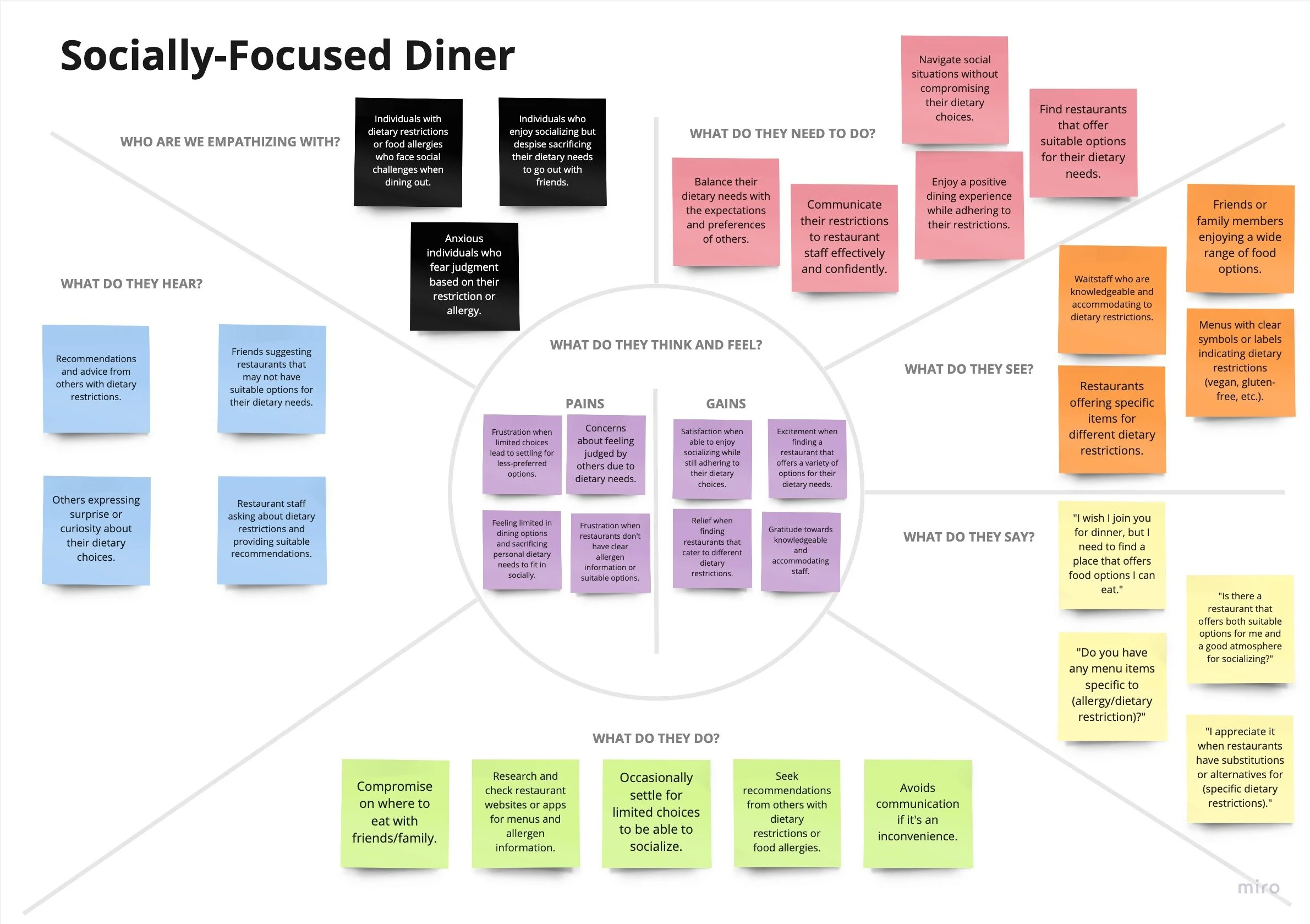
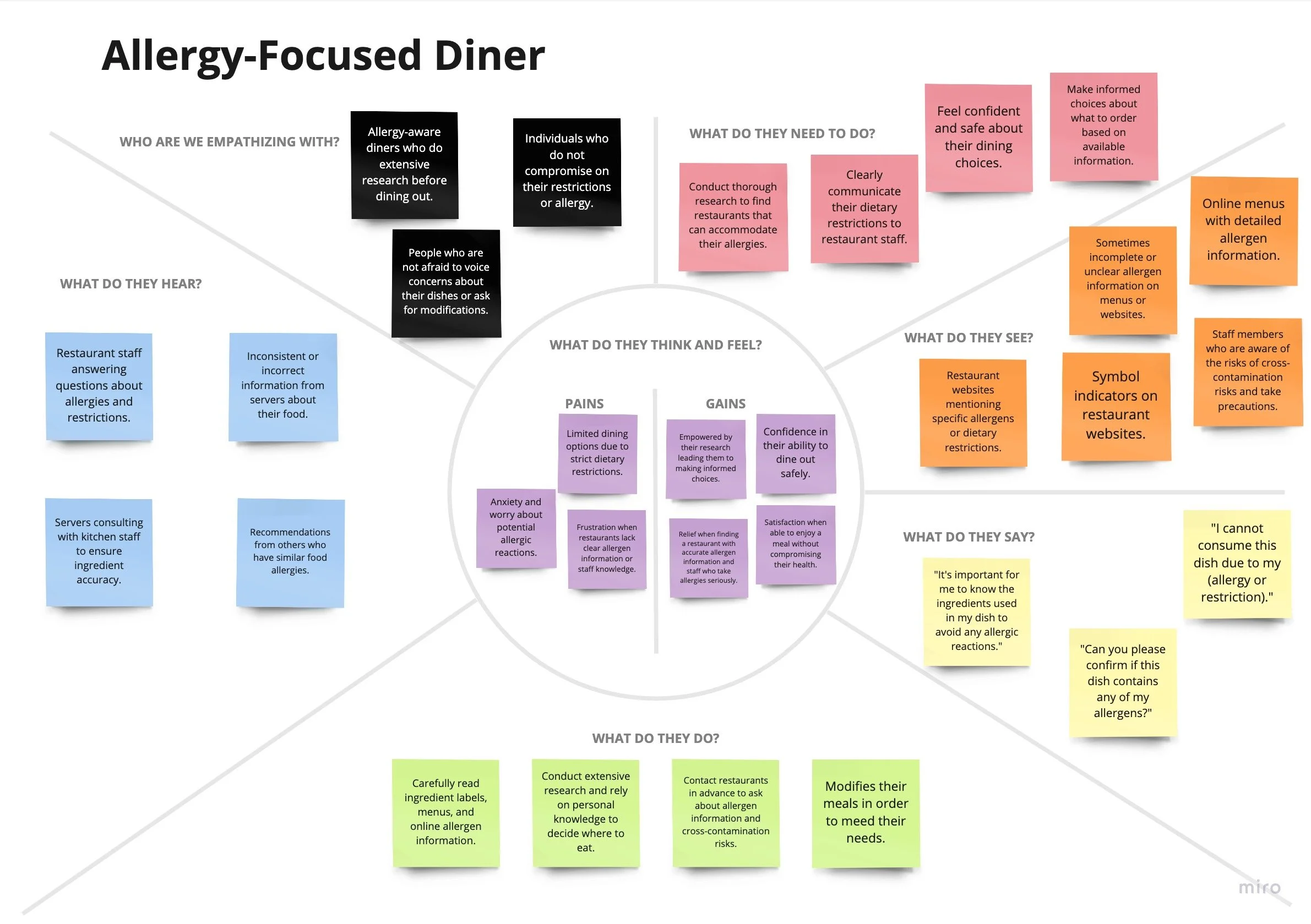
After reviewing my interview notes and creating an affinity map, I grouped each experience into empathy maps. These maps resulted in two personas: the Socially-Focused Diner and the Allergy-Focused Diner.
These personas provided concrete representations that will help shape my design process to be both emotionally resonant and functional.


Ideation
How might we…
ensure a wide range of accommodating food choices is easily visible to individuals with restrictions or allergies?
create a confident dining experience that eliminates the fear of judgment or isolation without sacrificing personal dietary needs?
improve access to precise and reliable allergen information for those with dietary restrictions and allergies?
enhance communication between restaurant staff and customers to ensure food safety and accurate information?
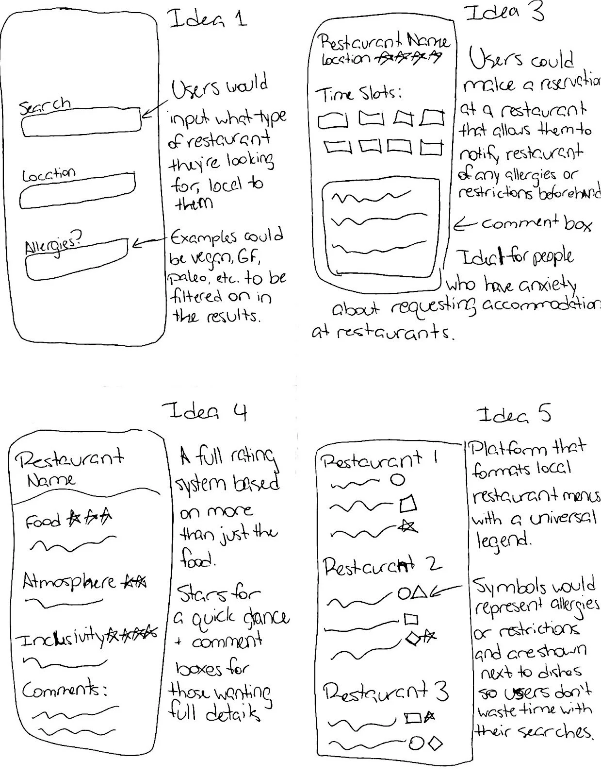
Brainstorming: Transforming dining challenges into creative solutions
I brainstormed ways to innovate the dining experience, addressing each HMW’s core concerns with various sketches. These potential design solutions were instrumental in bringing this project to life.
Ideas shown:
Idea 1: A search engine enabling users to discover nearby restaurants with customizable filters based on their specific dietary needs, ensuring they have a wide range of options.
Idea 3: A digital reservation system catering to users' dietary restrictions and allergies, allowing restaurants to make accommodations in advance for a confident dining experience.
Idea 4: A review system catering to dietary restrictions/allergies. Users can rate restaurants based on inclusivity, fostering a supportive community, and informing others.
Idea 5: Encourage restaurants to adopt a standardized allergen labeling system on their menus to indicate the presence of common allergens in each dish.
User stories:
User stories helped me refine essential needs into actionable features and tangible goals that addressed user requirements. I aimed to create solutions prioritizing satisfaction, inclusivity, and convenience.
As a user:
I want a dynamic interface for restaurant menus that updates in real-time based on current ingredients, allowing me to customize my choices and see what's available.

I want to use a search engine with customizable filters to find local restaurant options tailored to my needs.

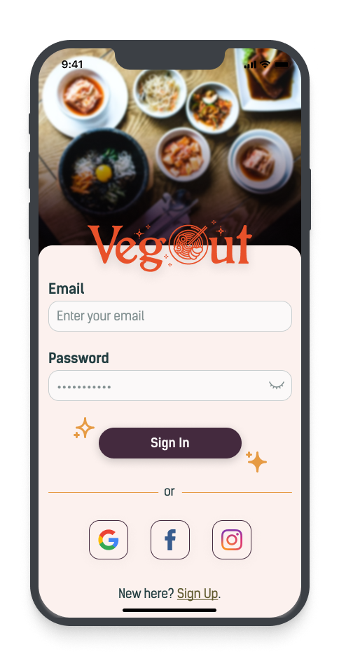
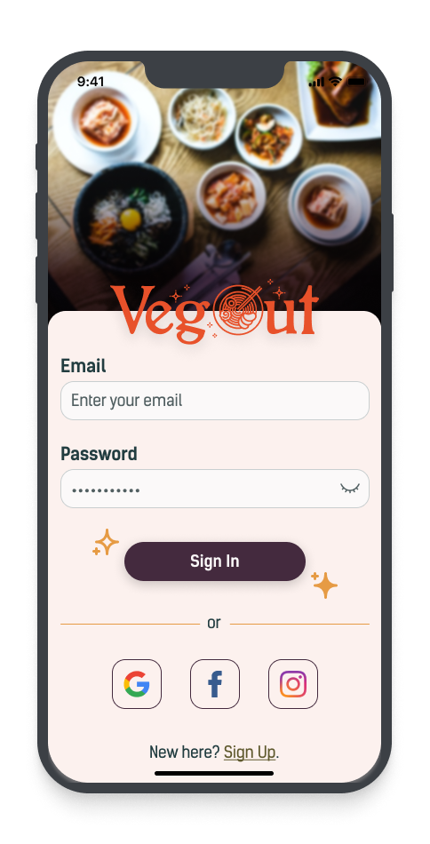
I want to create an account and log in so my dietary preferences will be remembered and saved.

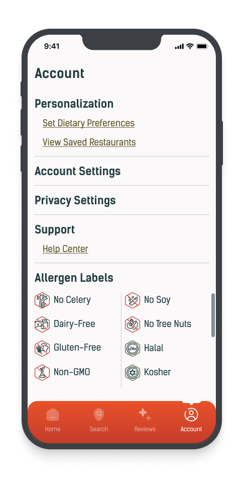
I want restaurants to adopt a standardized allergen labeling system on their menus to provide precise and reliable allergen information.

I want a review system for restaurants that considers inclusivity towards dietary restrictions so that users can make informed choices and feel supported.

Site map:
I prioritized essential app components and grouped key elements for intuitive navigation. With everything organized, I created a visual blueprint to showcase a user-friendly app design.
User Flows:
From the site map, I created user flow statements for three standardized app functions. These flows outlined efficient routes for user navigation.

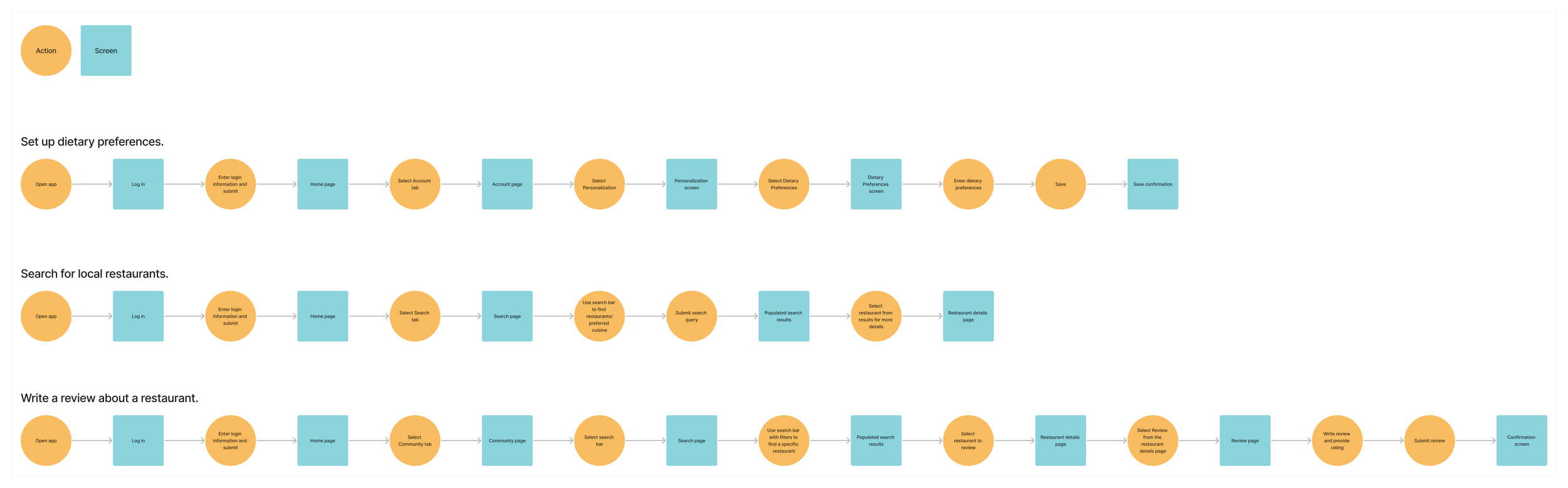
I sketched flow diagrams to map out user journeys for each red route, focusing on developing a cohesive and intuitive app interface.
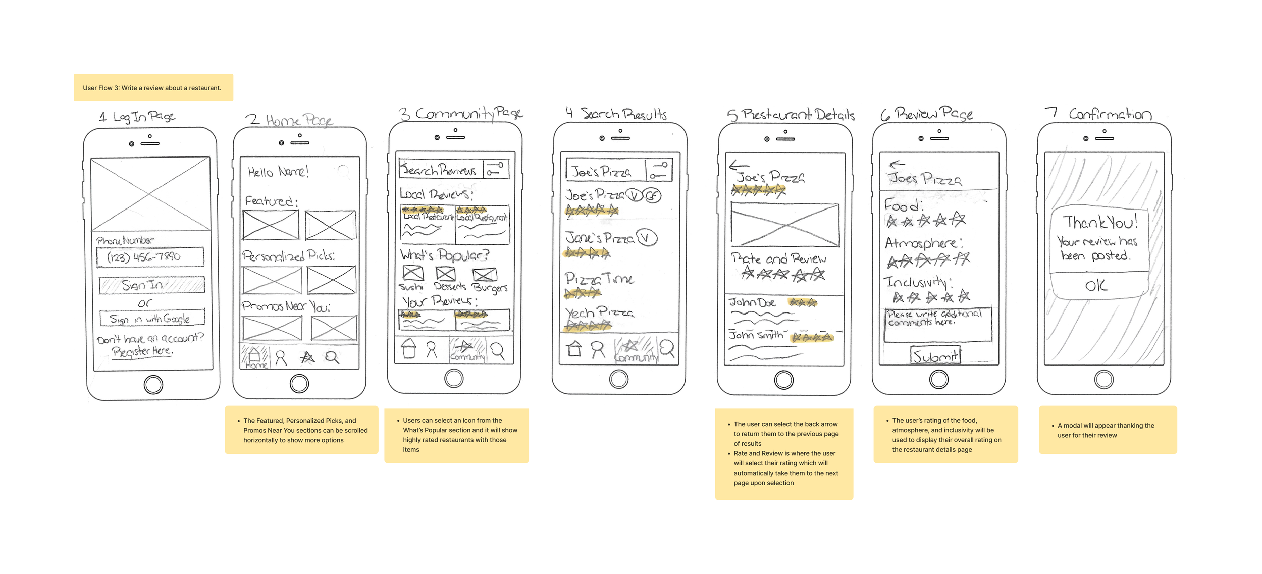
Wireframes:
Sketches were transformed into wireframes, allowing me to strike a balance between aesthetics and functionality.


Design
Capturing VegOut: A visual journey of simplicity, inclusivity, and trust
Mood board:
The chosen imagery for the mood board features communal dining, vibrant signage, and playful details. I aimed to capture the essence of culinary exploration with a brand that stands for simplicity, inclusivity, and trustworthiness.
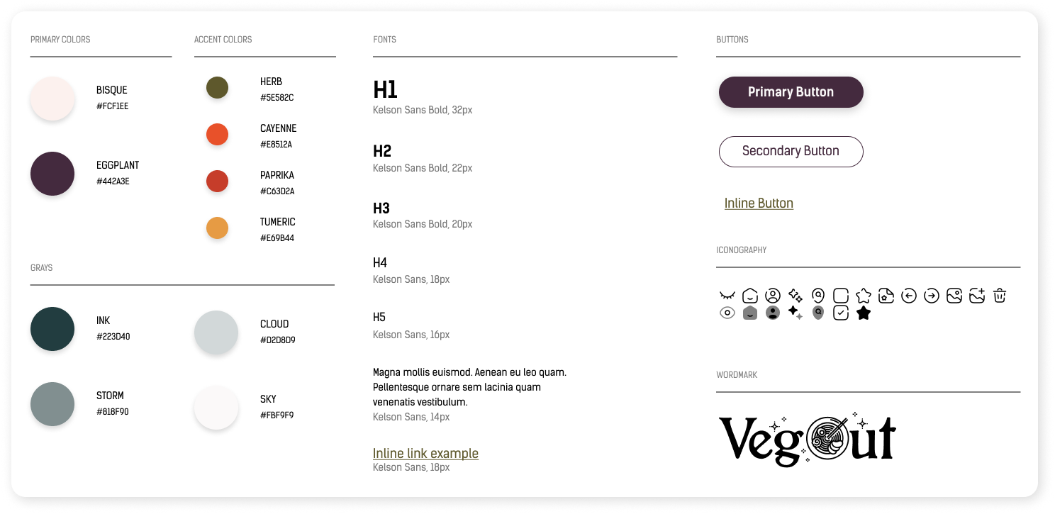
Style Guide:
The style guide unified VegOut's visual identity by defining the essentials: logo, color palette, and typography. It reflects the brand's platform as a sanctuary for culinary exploration and conveys a warm and welcoming atmosphere that guides users toward their ideal dining choices.

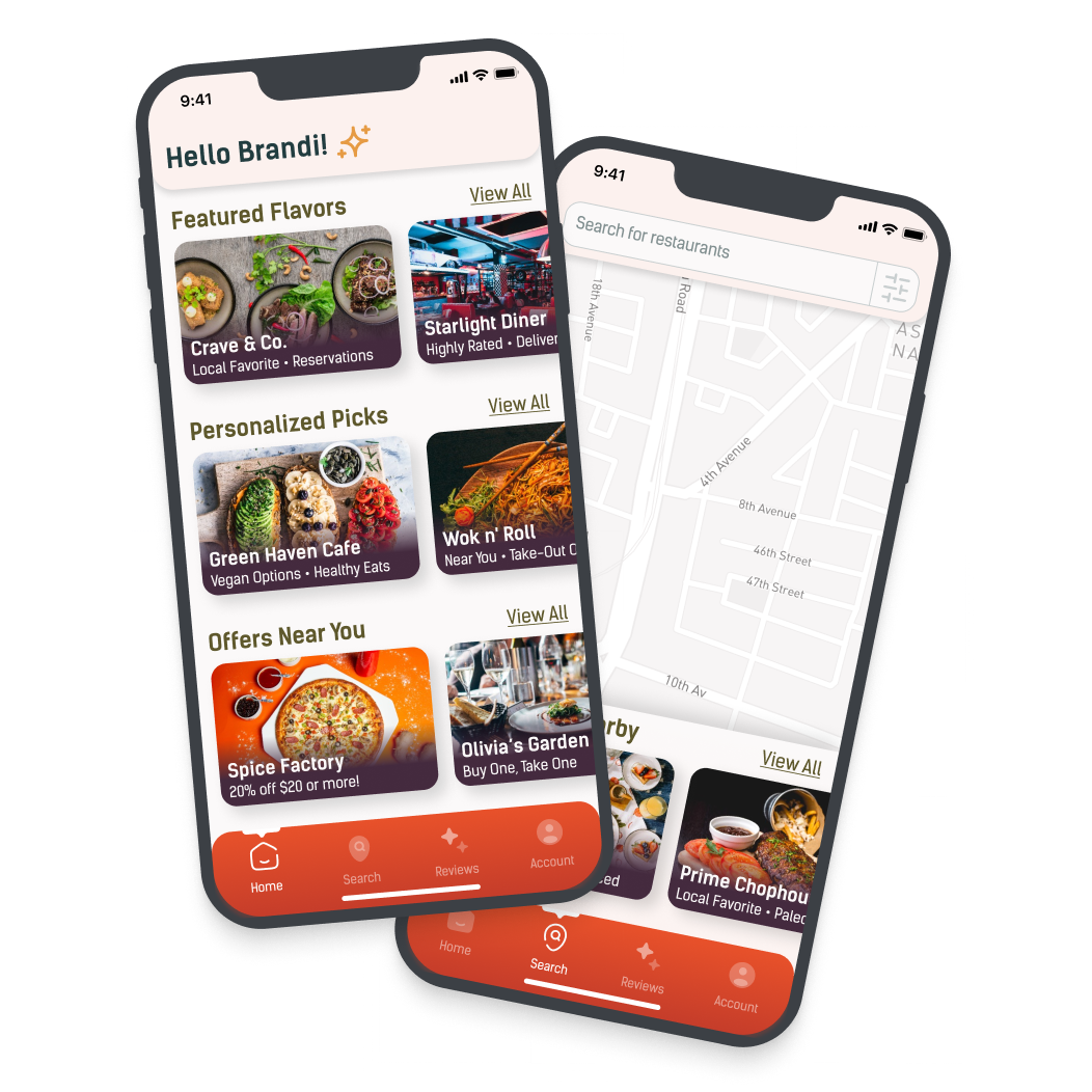
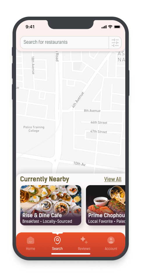
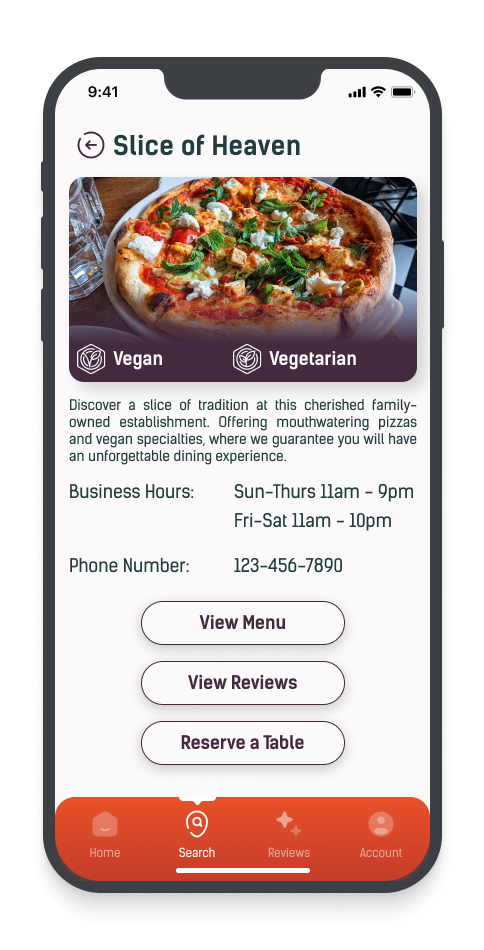
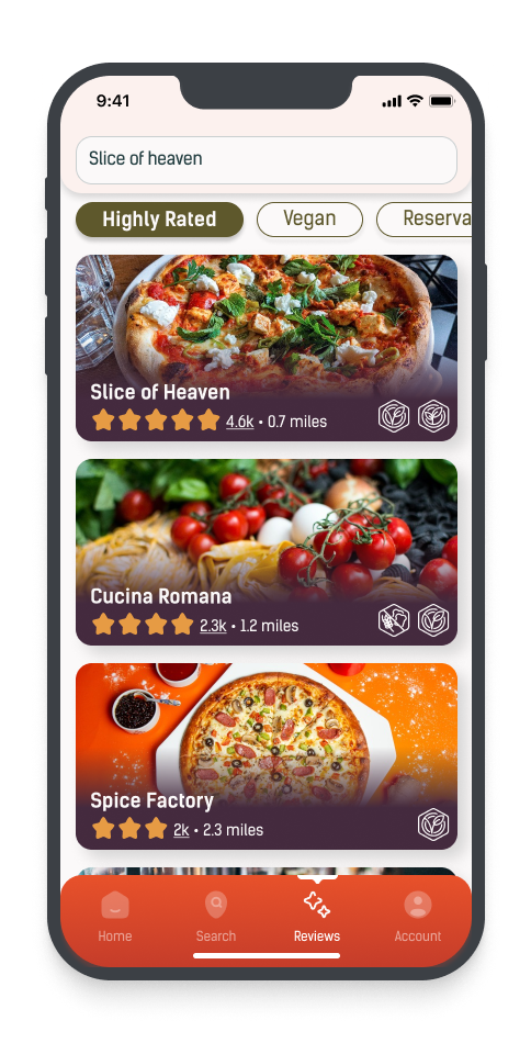
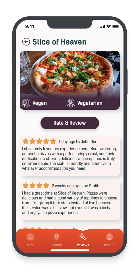
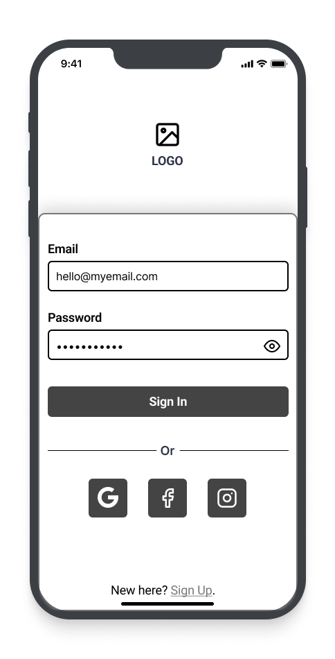
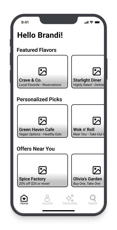
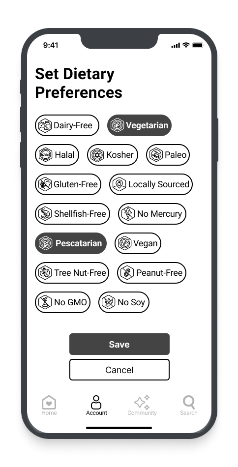
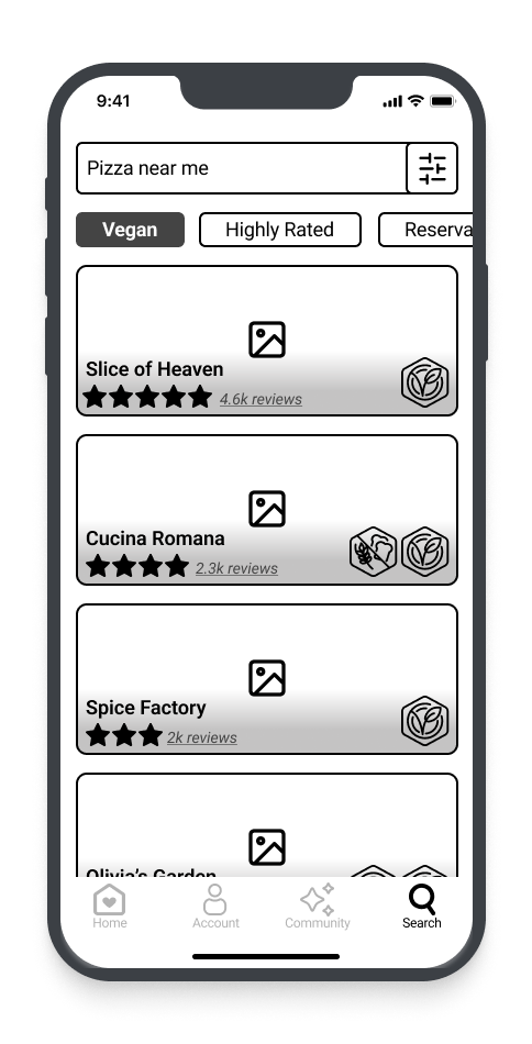
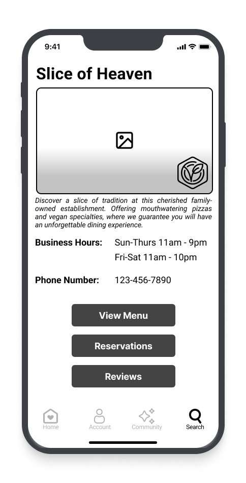
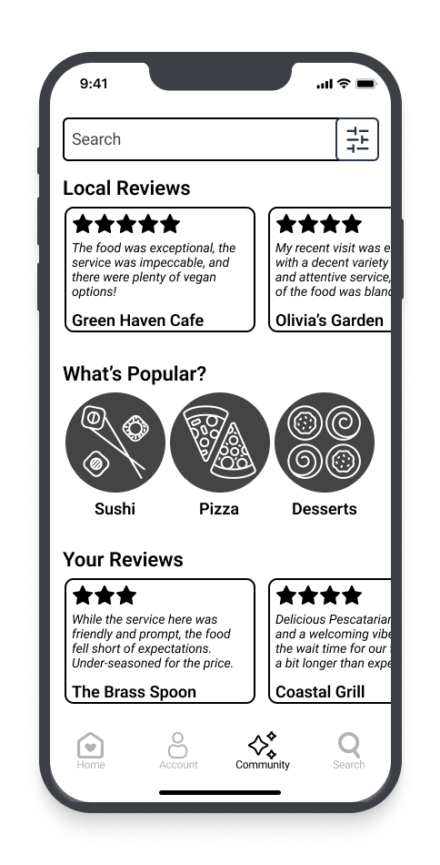
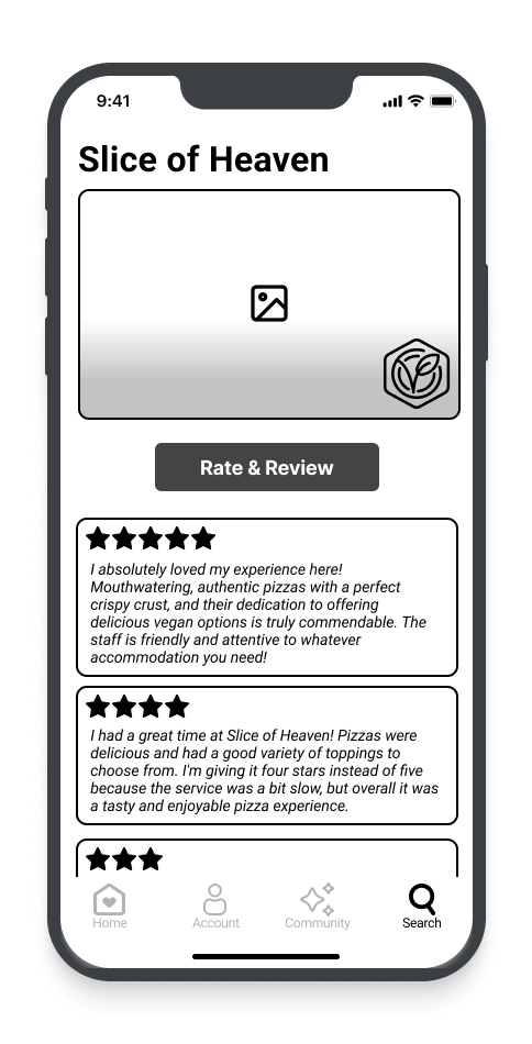
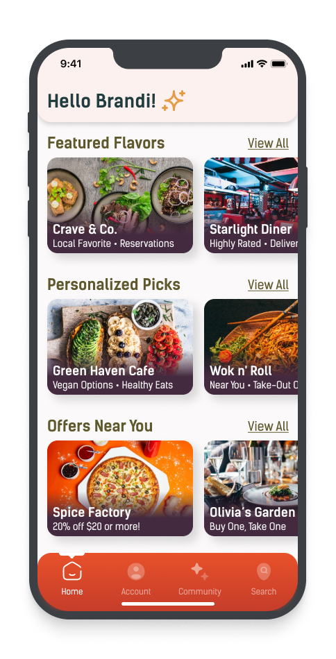
High-fidelity screens:
From the style guide, I designed an app interface with vibrant colors, modern fonts, realistic screen content, and a user-friendly process to enhance engagement.


Prototype:
I built interactive flows on my screens to mimic the user experience and find areas for improvement. After testing, I adjusted the navigation to make it more intuitive. Swapping the positions of Account and Search greatly improved usability and resulted in a seamless interface.
Testing
Usability Testing:
During the prototype testing, I conducted usability tests with five participants via Zoom. Each participant was tasked with completing three activities to help uncover any UI or usability issues.
Objectives:
Evaluate the efficiency and ease of completing the three primary user flows.
Identify obstacles or confusion points in each flow to improve the user experience.
Ensure the design aligns with the target audience’s needs and expectations, making necessary adjustments if needed.
Task 1:
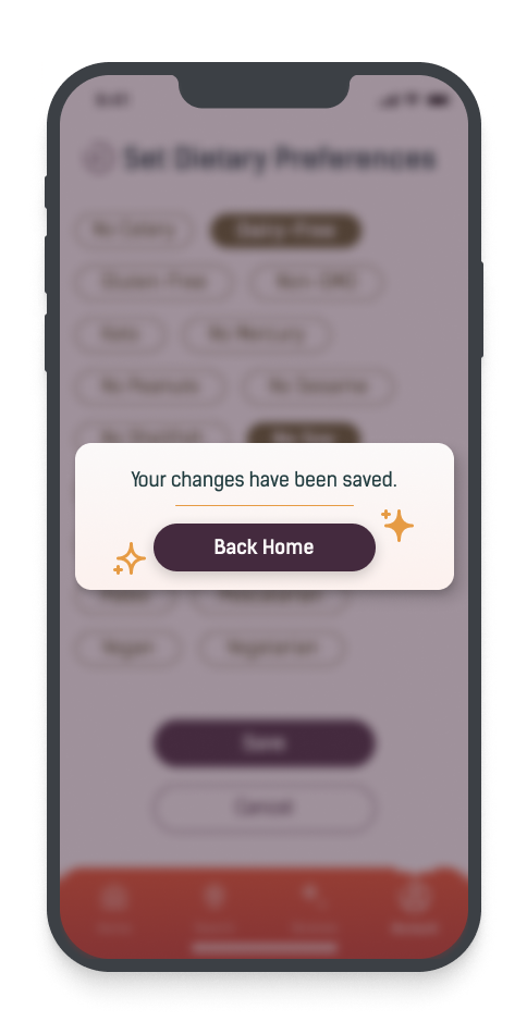
Set up dietary preferences.
Task 2:
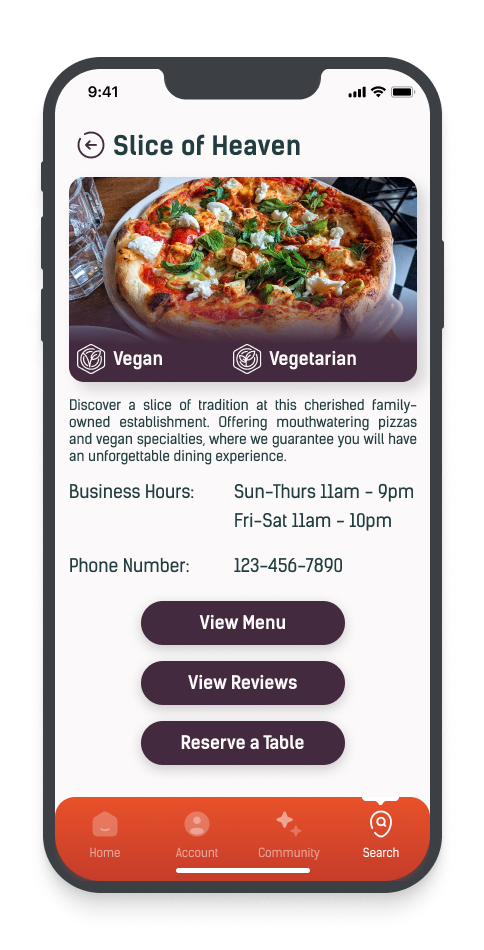
Find a vegan pizza restaurant.

Task 3:
Rate the restaurant from the previous search.

Test Results:
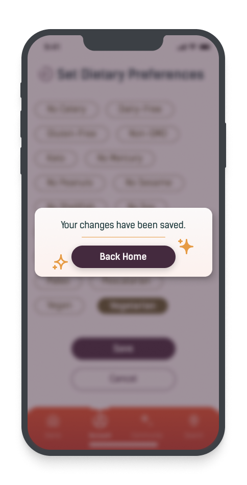
All five participants completed the tasks efficiently, but some areas in the app lacked clarity. I classified the issues by severity and suggested potential solutions to improve performance.
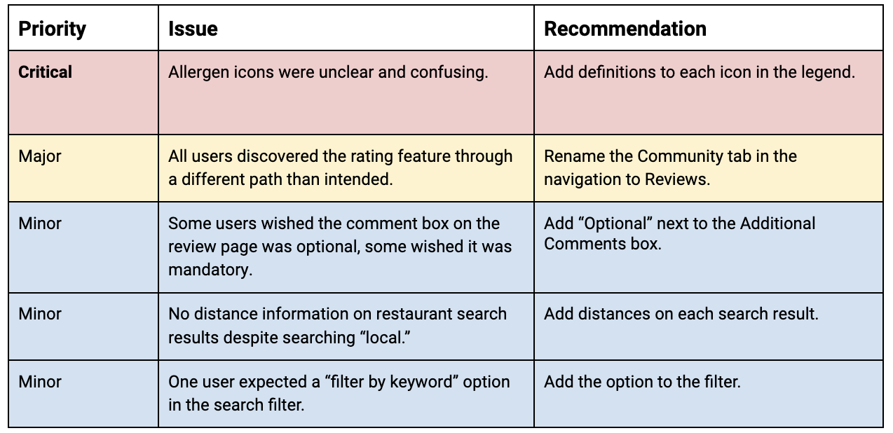
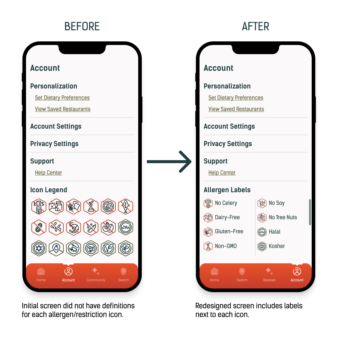
Issue 1: Allergen legend
40% of users expected icon definitions in the legend. Some users wanted interactive icons. The lack of labels caused confusion, especially for differentiating between vegan and vegetarian icons.
Solution: I redesigned the allergen legend with clear definitions for each icon to help users find restaurants catering to their specific needs.
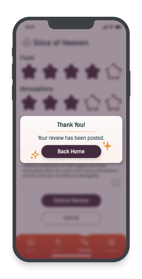
Issue 2: Review tab
Users discovered the rating feature by taking a different path than intended. They found it directly after the second user flow, through the "View Reviews" button on the restaurant details page.
Solution: To improve user understanding, I changed the Community tab to Reviews so users can easily access restaurant reviews through multiple pathways.
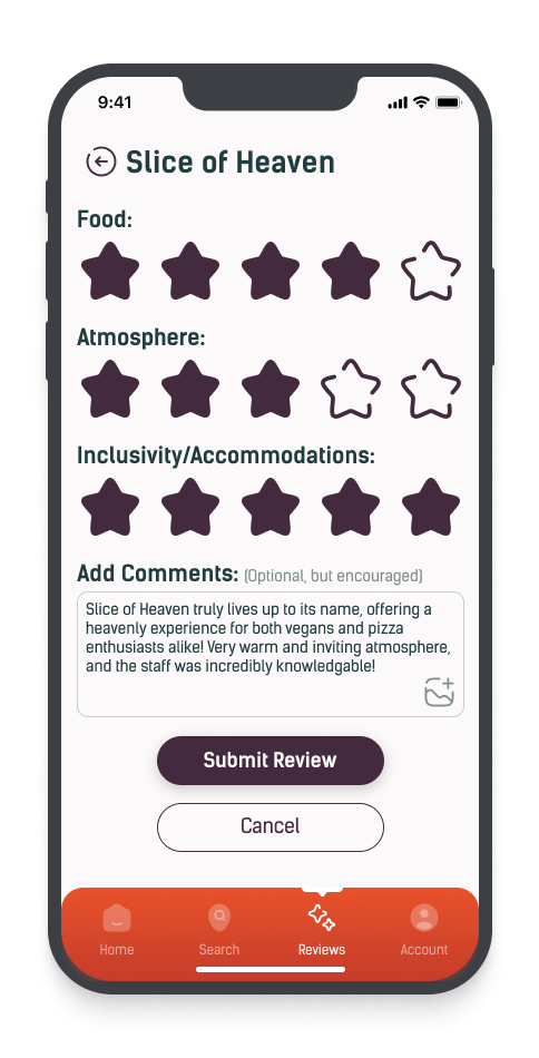
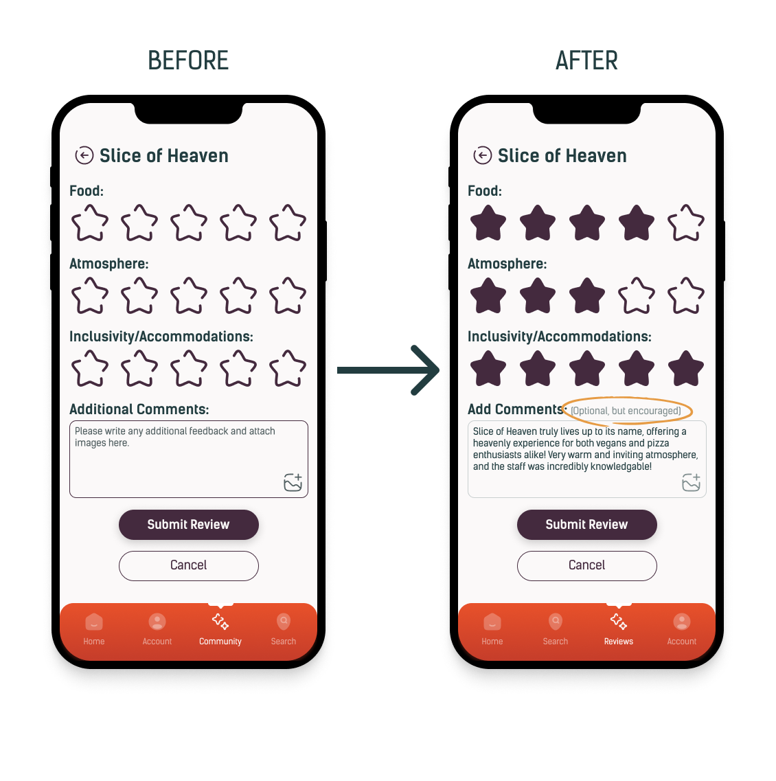
Issue 3: Rating system
While most users were satisfied with the rating system, opinions on the comment box were divided. Some users wanted the comment box to be optional, while others found it helpful for it to be required.
Solution: Adding "Optional but Encouraged" next to the comment box encouraged users to share their opinions without feeling pressured to provide comments.

Reflection
Designing the VegOut app was a transformative experience. Thorough research, ideation, design, and testing simplified the dining experience for those with dietary restrictions.
User-centered solutions
Prioritizing user needs and experiences is crucial in creating a visually appealing and intuitive product.
Iterative design
Multiple iterations and usability tests are vital in identifying and addressing issues to improve the user experience.
Design & functionality
Icons, labels, and buttons should be both aesthetically pleasing and practical in design.
Moving forward:
Including more user feedback and usability testing can improve the design process by identifying potential issues earlier, resulting in more polished and practical solutions.
My graphic and web design background helped me create a consistent and visually appealing app interface. This project provided a thorough understanding of user-centered design, iterative testing, and the impact of branding on the user experience. It reinforced the importance of continuous learning and adaptability in UX/UI design.